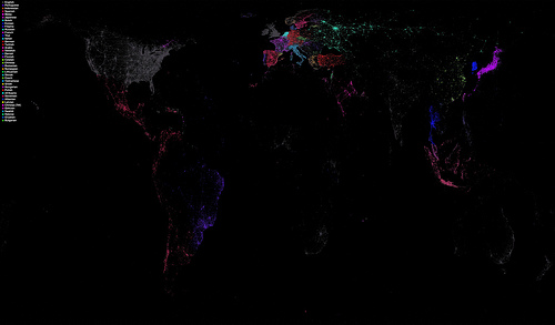
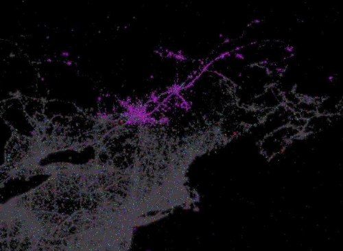
 Map enthusiast Eric Fischer has shared a wonderful language-mapping image via his Flickr stream. It is a map of Twitter use by language. There is some overlap in color key, so you have to deduce whether Twitter users are using French or Malay, but nonetheless this is a pretty cool visualization of language. If you browse the original image, you can see the minute details of language use (via technology) throughout the world. It’s also an interesting map of technology use: there is no distinction between land and sea, the colored points simply indicate each tweet.
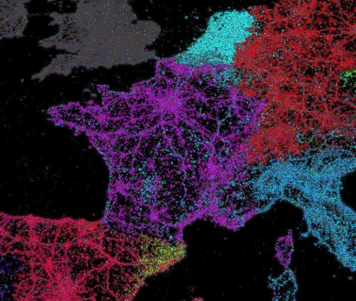
Above: France (Not just French, bien sûr)
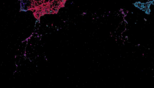
Above: North Africa


